Interview with Rob Janoff, designer of the Apple logo

Sunday, March 13, 2011 at 10:33 AM
here's the interview of the Apple logo, the source link you can find here


The Apple logo is one of the most famous logos in the world. Apple fans not only put this logo on their vehicles to show their loyalty, they go to the extreme of tattooing themselves with it, a level of dedication very few brands achieved. The logo is admired for it's simplicity and many meanings that people attach to it. It's timeless. For 30 years it has been unchanged and I expect at least another 30 before anything drastic will be done to it.
When Jean Louis Gassée (executive at Apple Computer from 1981 to 1990) was asked about his thoughts to the Apple logo he answered:
One of the deep mysteries to me is our logo, the symbol of lust and knowledge, bitten into, all crossed with the colors of the rainbow in the wrong order. You couldn't dream of a more appropriate logo: lust, knowledge, hope, and anarchy.

There are many theories about this logo and many of them are just that. Find out the truth, read the interview with Rob Janoff, the designer of the original Apple logo, who will tell you all about his design.
CB: When did you design the original Apple logo with the colorful stripes?
RJ: Early 1977. The agency got the account (Apple) sometime January. The logo was introduced with the new product Apple II in April of that year.

CB: Were you working for an agency at the time?

RJ: Yes, I was working for an advertising and public relations agency called Regis McKenna and I was an art director.

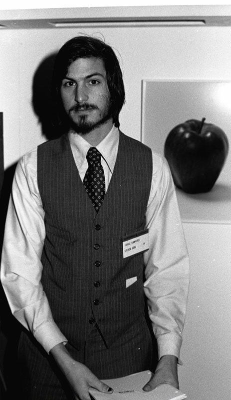
CB: Have you met Steve Jobs?
RJ: Sure. The first time must have been that first year. It was before he was getting his company started. So it was just Steve Jobs, Steve Wozniak and Mike Markkula. His was the elder guy who corralled these young entrepreneurs. And I think it's because Mike Markkula is how the account wound up at our agency. He was friends with my boss Regis McKenna.

CB: Did you get a brief from them?
RJ: Really there was no brief. But the really funny thing was the only direction we got from Steve Jobs is: "don't make it cute". There were briefs on subsequent jobs. First there was the logo, then there was an introductory ad and a sales brochure for the upcoming introduction. But it was pretty lose at that time. There was a previous logo to my logo. It was a logo done by Ron Wayne who was a very brief partner of the two Steves early on. He later took a buy-out, because he was a little concerned about the financial obligations he might have. He had a young family and the other guys didn't. Ron did a pen and ink drawing of Sir Isaac Newton sitting under an Apple tree with a poem all around the border. And, I think when Steve Jobs started to get serious about the Apple II and getting a prototype for the design of the shell he realized that logo would not do. So he needed a new logo.

Apple II
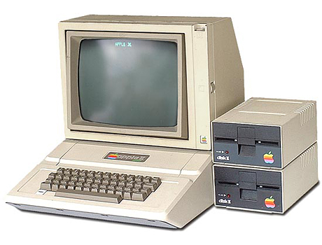
The original Apple II
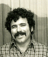

Rob Janoff in 1977
CB: How many versions did you do for the presentation?
RJ: We presented two versions of the logo. One with and one without the bite. Just in case he thought the bite was too cute. Fortunately he went with the one that gave it the most personality with the bite. Frankly it was a no brainer and you would miss the mark if you don't show some kind of an apple. When I presented I showed him several variations. Striped version, solid color version, metallic version. All those with the same shape.

CB: So even then you knew you needed a solid color version and a metallic version?

RJ: Yes, you kind of had to. When you're doing printing of either one or two color you need to have some way to go and I realized that the stripes would not always get it. The stripes really didn't work as a greyscale halftone.

CB: Do the colors represent the hippy culture, which was in fashion at the time?
RJ: Partially it was a really big influence. Both Steve and I came from that place, but the real solid reason for the stripes was that the Apple II was the first home or personal computer that could reproduce images on the monitor in color. So it represents color bars on the screen. Also, it was an attempt to make the logo very accessible to everyone, especially to young people so that Steve could get them into schools.

CB: At the time most logos were single color or 2 color logos. Anybody fought against the color stripes?

RJ: Steve liked the idea, because he liked things that were outside the box. And, it's not so revolutionary now, but it was a little different then. However I did get a lot of opposition from one of the higher account executives at agency. He was sort of working against me on the meeting where I presented the work to Steve. He made a comment that if this new company went ahead and produced stationary in all these colors they will go bankrupt before they start the business. That was kind of the attitude that I was facing from the agency. But Steve liked it right off. He's a pretty perceptive guy as we later learned and he liked the uniqueness of it as well. Also, I should add that the idea of a computer going into people's homes was a little bit threatening because up to then computers were for big businesses, who were highly technical and sensitive and all that stuff. Most of the personal computer products that were coming out at the time had very techno names. TRS-80 and things like that, so that's why the name Apple was so golden because it was basic and not technical and to go with that the colors were very important.


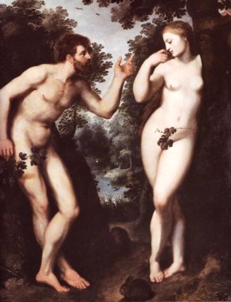
Adam and Eve by Reubens
CB: What does the bite in the apple represents? Is it a reference to a computing term byte? Is it a reference to the biblical event when Eve bit into the forbidden fruit? Is the fruit itself referencing the discovery of gravity by Newton when an apple fell on his head while sitting under the tree?
RJ: They are really interesting, but I'm afraid it didn't have a thing to do with it. From a designer's point of view and you probably experienced this, one of the big phenomena is having the experience of designing a logo for whatever reasons you design it, and years later you find out supposedly why you did certain things. And, they are all BS. It's a wonderful urban legend. Somebody starts it and then people go "oh yeah, that must be it".
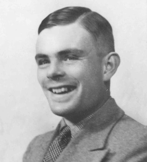

Alan Turing
CB: Is it possible you were influenced subconsciously by these stories?
RJ: Well, I'm probably the least religious person, so Adam and Eve didn't have anything to do with it. The bite of knowledge sounds fabulous, but that's not it. And, there is a whole lot of other lure about it. Turing the famous supposed father of computer science who committed suicide in the early 50's was british and was accused of being homosexual, which he was. He was facing a jail sentence so he committed suicide to avoid all that. So, I heard one of the legends being that the colored logo was an homage to him. People think I did the colored stripes because of the gay flag. And, that was something really thought for a long time. The other really cool part was that apparently he killed himself with a cyanide laced apple. And, then I found out Alan Turing's favorite childhood story was Snow White where she falls asleep forever for eating a poisoned apple to be woken up by the handsome prince. Anyway, when I explain the real reason why I did the bite it's kind of a let down. But I'll tell you. I designed it with a bite for scale, so people get that it was an apple not a cherry. Also it was kind of iconic about taking a bite out of an apple. Something that everyone can experience. It goes across cultures. If anybody ever had an apple he probably bitten into it and that's what you get. It was after I designed it, that my creative director told me: "Well you know, there is a computer term called byte". And I was like: "You're kidding!" So, it was like perfect, but it was coincidental that it was also a computer term. At the time I had to be told everything about basic computer terms.

CB: You obviously didn't design the logo on computer?

RJ: Actually, and it's a revelation to a lot of young designers. I get emails about the logo all the time asking me questions about the logo from all over the world and it's really kinda very satisfying because it's not something every designer gets a chance to talk to everybody because of some work you did. And, people ask me: did you design it on a computer? And of course at the time computers couldn't really do that for me. It was only years later till the Mac was designed, developed and refined that I even start working on a computer. At the time it was all pencil and paper, glue and cut paper, pens and all that stuff.


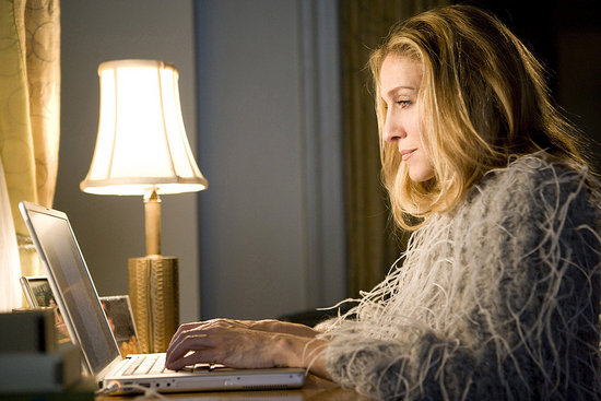
Powerbook in Sex and the City

CB: How does it feel to see your logo everywhere?
RJ: It's a real unique experience that still makes my day whenever I see it unexpectedly. You're watching a movie or tv and usually when they have a cool character they'll have a laptop with an Apple logo on it, like Meryl Streep in The Devil Wears Prada. I've done a lot of traveling and early on when the logo still had multicolored stripes on it I was in China and there it was on a billboard somewhere. It was Chinese script that I couldn't read, but something that came out of my head was up there for all to see and to interpret. It's kind of a personal thing. It's kinda like having a kid. You're very proud of it.


CB: Do you like the changes Apple made to your original design over the years?
RJ: I do like them. The stripes served their purpose and they are definitely dated. I think it's very important that a product like Apple keep very up-to-date and Steve Jobs is obviously very conscious of that and he has fabulous designers working for him in industrial design and graphic design. I feel great that it's still the same basic silhouette even though it went through lots and lots of changes. The apple shape changed slightly from my original design in the early 80's. The design firm Landor & Associates made the changes. They brightened the colors, they made the shapes much more symmetrical, much more geometric. When I designed it I pretty much did it freehand. I often think to myself why didn't I do that. It's because it wasn't where I was coming from at the time. I think they did a great job and it will be fascinating to see the next iteration and how it works out.

It's kind of a problem when you do something that so well known, so early on in your career. It's all downhill from then.
CB: What other projects are you proud of?
RJ: People assume that I continued in a pure design mode and did lot more logos. I did some logos, but my career path is more about advertising, which meant print and TV advertising. As far as image or logo type of thing there is really nothing that tops or comes close to the Apple logo. It's kind of a problem when you do something that so well known, so early on in your career. It's all downhill from then. I was proud of all the things I was involved in. How to do a television commercial, which really does take a while to understand. Those were the things that kept my interest. In advertising you work with words and images together, you work with more people. There is more a chance to come up with imagery that has double meanings, has to do with colloquialisms and all that. That's a long way of saying, there is nothing else that I'm as proud of and things were very different from then on.

CB: Do you use Macs today? Do you still work?

RJ: I'd really like to retire, but in this economy I really can't. I do work on a Mac, it's all I ever worked on. I would not know what to do with a left click and a right click. Been brand loyal all the way, even though the products cost a little bit more. I wouldn't think of using anything else. Plus, for graphics and design Apple has it all over Microsoft.

CB: Can you tell me a favorite logo of yours that is not designed by you?

RJ: There is a lot. I really do like other classic designs. Volkswagen because it's very clear what it is and it's been around for so long. I'm trying to think of other logos that incorporated the multicolor and I thought of NBC logo. I like logos with a relationship with positive and negative spaces, where something is revealed.


CB: Like the FedEx logo?
RJ: Yes, that's another one that I enjoy so much. It's very simple and if you study it you get the dynamic element of it with that arrow. Those are the kinds of logos I respond to.

CB: Can you give me the most important things to watch out for when designing a logo?

RJ: The main thing is to make it simple, because designers especially young designers tend to over-design or clients want too many things in there. I think people who tried to work a logo too hard, having too much meaning, wind up with something that's too complex. Logos usually have to be interpreted from very-very small to very-very large and that's not always easy. So, I think simplicity and readability is key. You're designing for an audience who really doesn't care as much as you do and unless it catches their interest right away they are going to pass right over it. So having it very readable is also important. Capturing the audiences imagination by having something revealed to them as they look at the logo is also important. Also, it's an opportunity to give whatever you're trying to portray a personality — this is something I try to do.

CB: Huge percentage of designers never receive formal education. Still some of them are doing great work. Do you think formal education is necessary?

RJ: Well, I don't think it's necessary, because I think I've learned most of the knowledge about graphics after I started working, not in school. I do think though that someone who is a successful designer has innate ability to see in a certain way. I know that I do. I tend to be a very visual person as opposed to verbal and I think that's a real important quality. Unfortunately now everyone has all of the tools at their disposal regardless whether they have any talent for designing. Everyone thinks he's a designer by pulling down a filter in Photoshop. So, I think no, you don't need all that much formal education and things can be learned obviously when working at it.
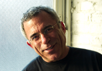

Rob Janoff in 2009
CB: Final question, what is your suggestion to our younger readers, what should they focus on to become great designers?
RJ: This is something I tell my kids: I could do this even if I'm not getting paid for it, because I like it so much, because now more than ever before there are so many people trying to become designers and work for agencies just because the tools that are available. So, it's harder and harder to get work. And, the way some people have to get work is by apprenticing and working for nothing for somebody until they get that job, because there is so much competition.

CB: Thank you so much for the interview!


 Well, actually I totally get his point of saying " From a designer's point of view and you probably experienced this, one of the big phenomena is having the experience of designing a logo for whatever reasons you design it, and years later you find out supposedly why you did certain things. And, they are all BS. It's a wonderful urban legend". I cannot agree more with this, because for times I've designed, there are so many things I  did without the intention of making like it should be. I just think "how about rotate it this way, flip it around  ..  and here I got a totally new experience with the things I'm working on.

Detecting OS by Using PHP

Wednesday, March 9, 2011 at 8:08 PM
well, while I was working on my project, I run into a problem of detecting OS by using PHP. After a bit of googling, I found a solution from Geek Pedia so big thanks to the guy who posted the solution but when I tried it on my comp, I have to deal with  another problem, since I have installed PHP 5.3 and the function eregi seems to be outdated. I have to come up with another solution myself. I just modified his code a little bit to work on my OS. So here it is, copy and paste it and test it:

function checkOS(){
    $OSList = array
    (
        // Match user agent string with operating systems
        'Windows 3.11' => '/Win16/i',
        'Windows 95' => '/(Windows 95)|(Win95)|(Windows_95)/i',
        'Windows 98' => '/(Windows 98)|(Win98)/i',
        'Windows 2000' => '/(Windows NT 5.0)|(Windows 2000)/i',
        'Windows XP' => '/(Windows NT 5.1)|(Windows XP)/i',
        'Windows Server 2003' => '/(Windows NT 5.2)/i',
        'Windows Vista' => '/(Windows NT 6.0)/i',
        'Windows 7' => '/(Windows NT 7.0)/',
        'Windows NT 4.0' => '/(Windows NT 4.0)|(WinNT4.0)|(WinNT)|(Windows NT)/i',
        'Windows ME' => '/Windows ME/i',
        'Open BSD' => '/OpenBSD/i',
        'Sun OS' => '/SunOS/i',
        'Linux' => '/(Linux)|(X11)/i',
        'Mac OS' => '/(Mac_PowerPC)|(Macintosh)/i',
        'QNX' => '/QNX/i',
        'BeOS' => '/BeOS/i',
        'OS/2' => '/OS/2/i',
        'Search Bot'=>'/(nuhk)|(Googlebot)|(Yammybot)|(Openbot)|(Slurp)|(MSNBot)|(Ask Jeeves/Teoma)|(ia_archiver)/i'
    );

    //     Loop through the array of user agents and matching operating systems
    foreach($OSList as $CurrOS=>$Match)
    {
            // Find a match
            if (preg_match($Match, $_SERVER['HTTP_USER_AGENT']))
            {
                    // We found the correct match
                    break;
            }
    }
    //echo "You are using ".$CurrOS;
    return $CurrOS;
}

Hope this help

Actionscript 3 trace instance name

Thursday, December 23, 2010 at 1:35 PM
While I was working on a Flash project with AS 3.0 involved, I happen to deal with a weird problem when I want to get the instance name by using code. It always ends in names like "instance11" or "instance61". At last, I found out the solution to this problem. Here it is:


 Assuming I have a button named "btnTest" on stage and I want to get the instance name . Normally we usually code like this:


btnTest.addEventListener(MouseEvent.CLICK, clkTest);

private function clkTest(e:MouseEvent):void {

trace(e.target.name) // It'd output something random like "instance61" instead of the instance name of the MC you are targeting,
}

you should change a little bit, just 1 line of code, like this:
e.currentTarget.name

Finally, I get the proper result.
trace(e.currentTarget.name) // It'd output "btnTest"

Convert bitmap to vector

Tuesday, December 21, 2010 at 12:36 AM

 Okie, this post is originally posted here. But I find it very useful especially when you're dealing with the "convert from raster to vector" problem in AI . It's a nice and easy way do achieve the result . So far so good, here it is.

Use Live Trace to Create Line Art in Adobe Illustrator

The Live Trace tool which was introduced into Adobe Illustrator CS2 is great for tracing line art, or even photos. Earlier trace tools weren't worth using if you wanted to create something with any accuracy - but that's all changed. Adobe Streamline was a standalone tracing product (to create vector graphic versions of rasterized images) which was improved, integrated into CS2, and renamed Live Trace. Here is how to use it to create accurate, clean line art in Illustrator. Below is a public domain image which I'll use as an example.

If your image is going to be black and white line art, it's best to make the edges as clearly defined as possible in Photoshop by using the levels tool (and possibly threshold as well). Place the image to be traced in Illustrator by selecting File/Place... Once it's placed, select the image and go to Object/Live Trace/Tracing Options... This will open the Live Trace dialogue box.

Click the Preview checkbox on the right. Select Black and White under Mode (or Grayscale if you'd like to include anti-aliasing). Adjust the settings until you're happy with the results. With Preview selected, this can be quite a time-consuming process depending on the speed of the computer you're using, but I've found it's the only way to get good results. For this image I used the settings as shown below.

When you're happy with the look of the line art, select Object/Live Trace/Expand. This will delete the original image from the layer and replace it with the new vectorized line art illustration. If you'd like to keep the original in the document, duplicate the layer containing the image before making the conversion.

You'll end up with a vectorized line art facsimile of the original. The accuracy of the line art depends on the resolution of the original and the settings you selected in the Tracing Options dialogue box. It's a trade off really - the more accurate the result, the more anchor points on the vector graphic, and the slower the machine creates it - but it still does a better job than Adobe Streamline ever did.

And here's the result. A clean, vectorized, infinitely scaleable piece of line art.

Merge 2 vector objects

Monday, December 20, 2010 at 8:35 PM
This is a problem which I run into when I was designing a logo for my class ( well, I'm still a newbie when it comes to AI, I know). And after minutes of googling I found out the solution, it's quite simple.
  • To merge two connected objects you could select both and use Window/Pathfinder: Add...
  • If they are not connected and they are not in groups you could select both and Object/Compound Path/Make.
That's all. Hope this can help someone out there stuck in the same problem like me.

How to Code C++ in XCode

Thursday, October 1, 2009 at 11:52 PM
I've just googled "how to code C++ in XCode " and I trust that I'm not the only one on this planet trying to find a way. And Voila , here is the way, though it cannot work with windows form or something like that or at least I still don't figure out yet, this is just command line but it's still better than nothing , right ?
Assuming you're up to date with XCode 3, I can get you started in 30 seconds:
1. Open XCode.
2. File/New Project...
3. In the "New Project" Assistant, expand the "Command Line Utility" group.
4. Select "C++ Tool"
5. Click "Next"
6. Give a project name and directory, then click "Finish".
7. Press Cmd-Shift-R to open the Console window. Output will appear there.
8. Click the "Build and Go" toolbar button.

That's it. Hello World done. From there you'll probably want to edit main.cpp to do other things.

"Do your work, don't be stupid"

Monday, August 31, 2009 at 3:19 AM


Recently I came across a nice wallpaper saying "Do your work, don't be stupid" and honestly I loved it from the first time. Motivational phrase like this really has a point on me. I know sometimes while I'm working on the computer, I tend to wind up doing some stuff but my work and since the day it was set as my default wallpaper for a little instant motivation, it really worked, this kind of wallpaper really bails me out. you know, looking right out there and seeing my friends working really hard then sit back, size things up , I'm sure that if you're surrounded by people who are motivated like that then you can't help but become more motivated yourself, and if you get somethings like this right in front of you whenever it comes up to the laziness, I think you get even more motivated :)
Just though I should share this wallpaper because I'm sure I'm not alone in this dilemma. if you're interested and for the best performance, leave your screen resolution here and I will send you as soon as I read your comment


I AM ME - I AM THE END

Sunday, August 16, 2009 at 9:29 AM

Hey there blogger,
It's been quite a long time to see me around me. soooo sorry, well , honestly I don't know what to write and how to bring the new atmosphere back to the zone .. I was trying the best to make it, here's another piece I've just made last night, this one it took more than one hour to finish it up and the result is what I was expecting. hope you guys like it. , big thank from Vietnam to abduzeedo and daily inspiration section

Collected Quotes from Albert Einstein

Wednesday, July 22, 2009 at 9:06 PM

[Note: This list of Einstein quotes was being forwarded around the Internet in e-mail, so I decided to put it on my web page. I'm afraid I can't vouch for its authenticity, tell you where it came from, who compiled the list, who Kevin Harris is, or anything like that. Still, the quotes are interesting and enlightening.]

Collected Quotes from Albert Einstein

  • "Any intelligent fool can make things bigger, more complex, and more violent. It takes a touch of genius -- and a lot of courage -- to move in the opposite direction."
  • "Imagination is more important than knowledge."
  • "Gravitation is not responsible for people falling in love."
  • "I want to know God's thoughts; the rest are details."
  • "The hardest thing in the world to understand is the income tax."
  • "Reality is merely an illusion, albeit a very persistent one."
  • "The only real valuable thing is intuition."
  • "A person starts to live when he can live outside himself."
  • "I am convinced that He (God) does not play dice."
  • "God is subtle but he is not malicious."
  • "Weakness of attitude becomes weakness of character."
  • "I never think of the future. It comes soon enough."
  • "The eternal mystery of the world is its comprehensibility."
  • "Sometimes one pays most for the things one gets for nothing."
  • "Science without religion is lame. Religion without science is blind."
  • "Anyone who has never made a mistake has never tried anything new."
  • "Great spirits have often encountered violent opposition from weak minds."
  • "Everything should be made as simple as possible, but not simpler."
  • "Common sense is the collection of prejudices acquired by age eighteen."
  • "Science is a wonderful thing if one does not have to earn one's living at it."
  • "The secret to creativity is knowing how to hide your sources."
  • "The only thing that interferes with my learning is my education."
  • "God does not care about our mathematical difficulties. He integrates empirically."
  • "The whole of science is nothing more than a refinement of everyday thinking."
  • "Technological progress is like an axe in the hands of a pathological criminal."
  • "Peace cannot be kept by force. It can only be achieved by understanding."
  • "The most incomprehensible thing about the world is that it is comprehensible."
  • "We can't solve problems by using the same kind of thinking we used when we created them."
  • "Education is what remains after one has forgotten everything he learned in school."
  • "The important thing is not to stop questioning. Curiosity has its own reason for existing."
  • "Do not worry about your difficulties in Mathematics. I can assure you mine are still greater."
  • "Equations are more important to me, because politics is for the present, but an equation is something for eternity."
  • "If A is a success in life, then A equals x plus y plus z. Work is x; y is play; and z is keeping your mouth shut."
  • "Two things are infinite: the universe and human stupidity; and I'm not sure about the the universe."
  • "As far as the laws of mathematics refer to reality, they are not certain, as far as they are certain, they do not refer to reality."
  • "Whoever undertakes to set himself up as a judge of Truth and Knowledge is shipwrecked by the laughter of the gods."
  • "I know not with what weapons World War III will be fought, but World War IV will be fought with sticks and stones."
  • "In order to form an immaculate member of a flock of sheep one must, above all, be a sheep."
  • "The fear of death is the most unjustified of all fears, for there's no risk of accident for someone who's dead."
  • "Too many of us look upon Americans as dollar chasers. This is a cruel libel, even if it is reiterated thoughtlessly by the Americans themselves."
  • "Heroism on command, senseless violence, and all the loathsome nonsense that goes by the name of patriotism -- how passionately I hate them!"
  • "No, this trick won't work...How on earth are you ever going to explain in terms of chemistry and physics so important a biological phenomenon as first love?"
  • "My religion consists of a humble admiration of the illimitable superior spirit who reveals himself in the slight details we are able to perceive with our frail and feeble mind."
  • "Yes, we have to divide up our time like that, between our politics and our equations. But to me our equations are far more important, for politics are only a matter of present concern. A mathematical equation stands forever."
  • "The release of atom power has changed everything except our way of thinking...the solution to this problem lies in the heart of mankind. If only I had known, I should have become a watchmaker."
  • "Great spirits have always found violent opposition from mediocrities. The latter cannot understand it when a man does not thoughtlessly submit to hereditary prejudices but honestly and courageously uses his intelligence."
  • "The most beautiful thing we can experience is the mysterious. It is the source of all true art and all science. He to whom this emotion is a stranger, who can no longer pause to wonder and stand rapt in awe, is as good as dead: his eyes are closed."
  • "A man's ethical behavior should be based effectually on sympathy, education, and social ties; no religious basis is necessary. Man would indeeded be in a poor way if he had to be restrained by fear of punishment and hope of reward after death."
  • "The further the spiritual evolution of mankind advances, the more certain it seems to me that the path to genuine religiosity does not lie through the fear of life, and the fear of death, and blind faith, but through striving after rational knowledge."
  • "Now he has departed from this strange world a little ahead of me. That means nothing. People like us, who believe in physics, know that the distinction between past, present, and future is only a stubbornly persistent illusion."
  • "You see, wire telegraph is a kind of a very, very long cat. You pull his tail in New York and his head is meowing in Los Angeles. Do you understand this? And radio operates exactly the same way: you send signals here, they receive them there. The only difference is that there is no cat."
  • "One had to cram all this stuff into one's mind for the examinations, whether one liked it or not. This coercion had such a deterring effect on me that, after I had passed the final examination, I found the consideration of any scientific problems distasteful to me for an entire year."
  • "...one of the strongest motives that lead men to art and science is escape from everyday life with its painful crudity and hopeless dreariness, from the fetters of one's own ever-shifting desires. A finely tempered nature longs to escape from the personal life into the world of objective perception and thought."
  • "He who joyfully marches to music rank and file, has already earned my contempt. He has been given a large brain by mistake, since for him the spinal cord would surely suffice. This disgrace to civilization should be done away with at once. Heroism at command, how violently I hate all this, how despicable and ignoble war is; I would rather be torn to shreds than be a part of so base an action. It is my conviction that killing under the cloak of war is nothing but an act of murder."
  • "A human being is a part of a whole, called by us _universe_, a part limited in time and space. He experiences himself, his thoughts and feelings as something separated from the rest... a kind of optical delusion of his consciousness. This delusion is a kind of prison for us, restricting us to our personal desires and to affection for a few persons nearest to us. Our task must be to free ourselves from this prison by widening our circle of compassion to embrace all living creatures and the whole of nature in its beauty."
  • "Not everything that counts can be counted, and not everything that can be counted counts." (Sign hanging in Einstein's office at Princeton)

Copyright: Kevin Harris 1995 (may be freely distributed with this acknowledgement)

Workstation of popular websites

Tuesday, July 7, 2009 at 9:18 PM
source: http://www.webdesignerdepot.com/2009/02/the-workstations-of-popular-websites/

As a blogger myself, I’ve always wondered what other people’s workstations look like. I realize many of you probably wonder the same thing, so I’ve decided to prepare this post which includes photos of work spaces from popular blogs and websites.

Most pictures show Mac computers being used, sometimes in conjunction with PC’s and/or laptops. It’s also interesting to see how some spaces are very clean and minimalistic, while others draw inspiration from busier set ups.

Thanks to all of you that participated in this fun article and sent their images. Finally, if you have a popular website or blog and would like to be featured here, simply contact me so that I can include it here. The article will be expanded as other photos get submitted over the coming days.

Now, let’s go explore some interesting workstations and get inspired…


Chris Spooner’s SpoonGraphics


Brian Hoff’s The Design Cubicle


Darren Rowse’s Problogger


Jay Hilgert’s BittBox


Elliot Jay Stocks


Walter Apai’s Webdesigner Depot


Jonathan Snook’s Snook


Henry Jones’ WebDesignLedger


Gino Orlandi’s YouTheDesigner


Wolfgang’s Bartelme


Navdeep Raj’s Dezinerfolio


Steven Snell’s DesignM.ag and Vandelay Design


Dan Rubin’s SuperfluousBanter


Todd Garland’s BuySellAds


Scott Willoughby’s SEOMoz


Nick La’s Web Designer Wall


Gabriel Segura’s CSS Mania


Chris Coyier’s CSS-Tricks


InstantShift


Kai Loon’s Kailoon


Niki Brown’s The Design O’Blog


Toxel


James Qu’s PSD Vault


David and Marc Perel’s We Are Not Freelancers


Frank Jeitz’s FudgeGraphics


Matt Cronin’s Spoonfed Design


Adelle Charles’ Fuel Your Creativity


David Appleyard’s Design Shack and David Appleyard.net


Jacob Cass’ Just Creative Design


Dmitry Fadeyev’s Usability Post


Andrew Houle’s My Ink Blog


Daved’s Broche’s Outlaw Design Blog


Alex Giron’s CSS Beauty


Alen Grakalic’s CSS Globe


Eli Burford’s Design Blurb


Eva Sajdak & Paul Wozniak’s My Photoshop Brushes


John Mills’ CSS Remix


Liam McKay’s We Function


Chad Mueller’s Inspiredology


Jan’s Dawghouse


Aran Down’s Studio 7 Designs

david-desk-messy
David Legget’s Tutorial 9

david-airey-office-1
David Airey

darius_desktop_615
Darius Monsef’s Colour Lovers

source: http://www.webdesignerdepot.com/2009/02/the-workstations-of-popular-websites/